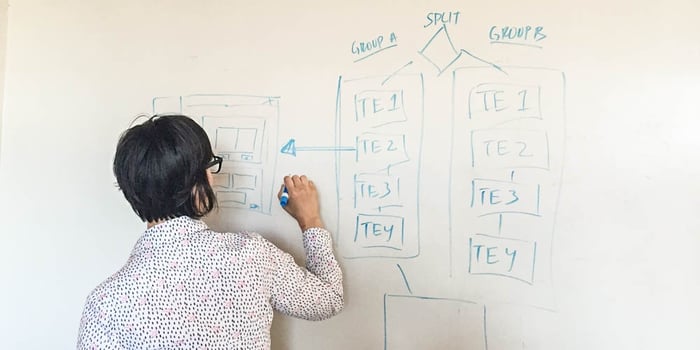
We sat down with Emily Bottis, User Experience Architect, to talk about her role at HBX and to learn what goes into designing and developing platform features.
What do you do at HBX?
I am the user experience architect. I work across the teams at HBX to design and improve the digital learning experience of our students.
What does a normal day look like for you?
Every day I create and review new feature and enhancement requirements and design. I regularly meet with the software development team to discuss how we translate these designs into code. I also typically meet with the course development team to discuss and design new interactive course features.
Where did you go to school and what did you study?
I attended Brown University and studied Organizational Behavior.
Any hidden talents?
When I'm not chasing my kids around, I am into photography, writing, and I play ice hockey!
What is your favorite food?
I love anything Indian or Middle Eastern, and I am a vegetarian.
How did HBX start building the platform?
First, we had discussions with the faculty members about how they wanted to build their courses. Through these discussions, we decided that we wanted the courses to be real-world, interactive, and social. Based on those goals, we envisioned the ideal platform, making sure to incorporate the Harvard Business School teaching methodology which meant using the case study method.
What's a Teaching Element?
Teaching elements are small units of learning content that exist in the course on what we call the concept pages. Examples of teaching elements are spreadsheets, videos, and drag categorization.
Tell me about how you built peer interaction into the platform.
When we began building the peer interaction platform we made an effort to keep the discussions close to the content. The goal was to intentionally couple the peer interaction platform with the course content so that peer interaction would be available in the educational context.

What's your favorite feature?
The concept page side bar. This side bar is a navigational element which helps you navigate through the entire course, and we added it in after a bunch of student input and feedback.
How do you decide what features to add/change on the platform?
Altering the platform is primarily based on participant feedback. We constantly run surveys and focus groups to figure out what aspects of the platform are working for our participants and what aspects are not working. We also have a team of people who work on the “release planning process.” This is the process we go through before we add or change something in the platform. My personal job is to represent our users. I am always pushing to make additions to the platform based on direct participant feedback.
What surprised you most about the learning experience once users went through the course?
The enthusiasm and creativity that people have brought to our courses. Also, I am constantly impressed by the commitment our students have, it is awesome!
Any cool features in development?
We are currently experimenting with mobile, designing a new search function, and we are also building new courses!


