The past decade has seen the rise of digital databases along with the development of new tools to create engaging, often interactive, visual displays. Today, anyone with an interest in a topic can easily find relevant data and present it in an interesting way.
Here are a few examples that caught my fancy:
Jobs
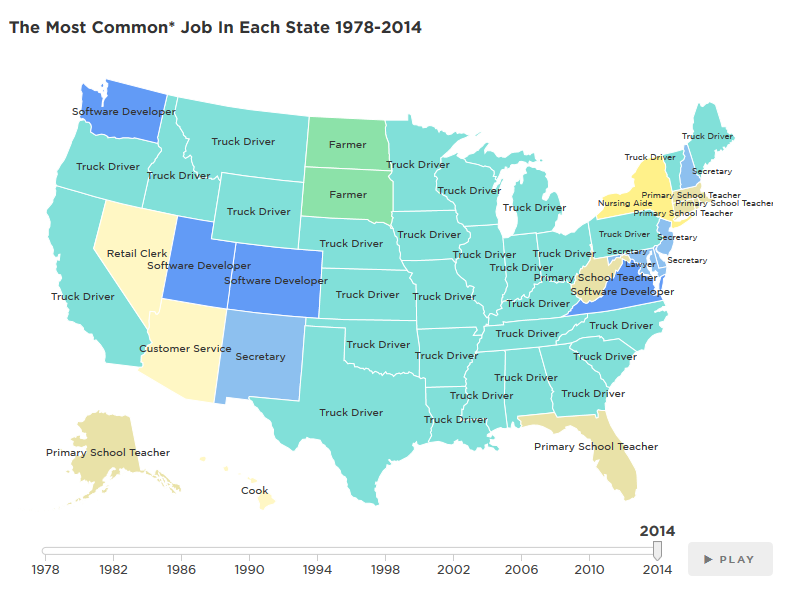
Source: NPRNational Public Radio has produced a great animated display of the most common jobs in each state, year by year from 1978 to 2014.
My favorite part: The story is told by jobs that gain in popularity and then become less common.
Web-Related Statistics
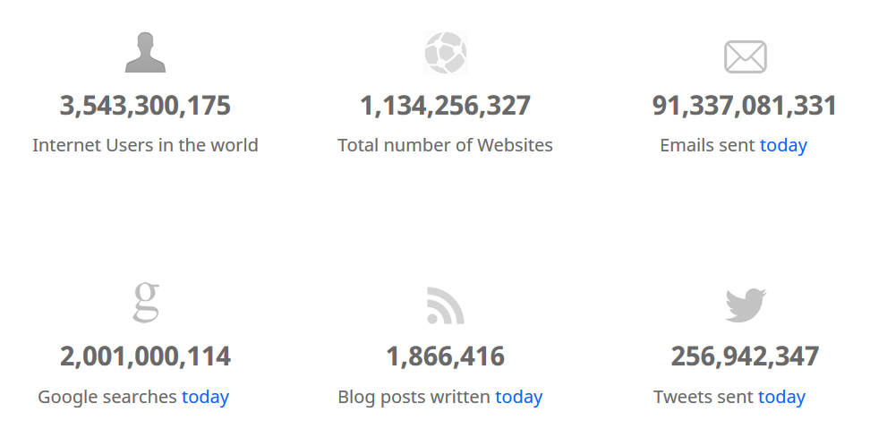
Source: Internet Live StatsInternet Live Stats has tracked web-related statistics and pioneered methods for visualizing data for several years, and it's instructive to see how different digital properties have ebbed and flowed over time.
My favorite part: The "One Second" tab, which shows the number tweets, Facebook posts, Instagram photos, and other digital content shared each second. The way they present this information is extremely effective.
Beer
Source: FlowingDataIf you love beer as much as I do, you'll appreciate Flowing Data's graphic analysis of beer attributes and how they relate to different styles. And if you just like cool visual displays of data, you'll probably spend a lot of time poking around the site (which I find even more addictive than TV Tropes).
My favorite part: The examples of each type of beer, which make it easy to find new brews to try.
Food
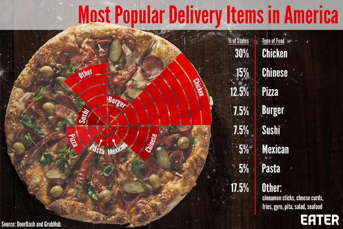
Source: EaterEater is a great site for all kinds of interesting food information, and has created this interactive, which shows the most common foods ordered for delivery in each state of the US. Warning, this may make you hungry!
My favorite part: Learning that my fellow Massachusetts residents love sushi just as much as I do!
Hamilton
Source: Wall Street JournalAnd finally the Wall Street Journal gives us an interactive visual presentation on the rhyme structure of the lyrics of Hamilton, along with some qualitative analysis of its influences, ranging from Gilbert and Sullivan to Rakim.
My favorite part: The links to various works that inspired Lin-Miranda as he was writing the show.
Interested in learning more about how to interpret data? Take HBX CORe and discover the basics of Economics for Managers, Financial Accounting, and Business Analytics.
About the Author
Jenny is a member of the HBX Course Delivery Team and currently works on the Business Analytics course for the Credential of Readiness (CORe) program, and supports the development of a new course in Management for the HBX platform.
Jenny holds a BFA in theater from New York University and a PhD in Social Psychology from University of Massachusetts at Amherst. She is active in the greater Boston arts and theater community, and she enjoys solving and creating diabolically difficult word puzzles.


