<iframe src="https://5923915.fls.doubleclick.net/activityi;src=5923915;type=hbx_core;cat=hbx_b0;dc_lat=;dc_rdid=;tag_for_child_directed_treatment=;ord=1;num=1?" width="1" height="1" frameborder="0" style="display:none">
HBX Business Blog

Jenny Gutbezahl

Jenny is a member of the HBX Course Delivery Team and works on the Business Analytics course for the Credential of Readiness (CORe) program. She has a PhD in social psychology from the University of Massachusetts at Amherst with a minor in quantitative research methods. She has worked in a variety of socially relevant areas of research including education, the arts, homelessness, and for such organizations as NASA's Space Science Enterprise, National Public Radio, the National Basketball Association, and the Ig Nobel Awards committee.

Recent Posts

How to Minimize Biases in Your Analyses

Posted by Jenny Gutbezahl on June 13, 2017 at 1:58 PM

illustration of three people completing a survey

In statistics, we draw a sample from a population and use the things we observe about the sample to make generalizations about the entire population. For example, we might present a subset of visitors to a website with different versions of a page to get an estimate of how ALL visitors to the site would react to them. Because there is always random variability (error), we don't expect the sample to be a perfect representation of the population. However, if it's a reasonably large, well-selected sample, we can expect that the statistics we calculate from it are fair estimates of the population parameters.

Bias is anything that leads to a systematic difference between the true parameters of a population and the statistics used to estimate those parameters. Here are a few of the most common types of bias and what can be done to minimize their effects.

Bias in Sampling

In an unbiased random sample, every case in the population should have an equal likelihood of being part of the sample. However, most data selection methods are not truly random.

Take exit polling. In exit polling, volunteers stop people as they are leaving the voting place and ask them who they voted for. This method leads to the exclusion of those who vote by absentee ballot. Furthermore, research suggests the people are more likely to gather data from people similar to themselves.

Polling volunteers are more likely to be young, college educated, and white compared with the general population. It's understandable that a white college student will be more likely to approach someone who looks like they could be one of their classmates than a middle-aged woman, struggling to keep three children under control by speaking to them in a language the student does not understand. This means not every person has the same chance of being selected for an exit poll.

Bias in Assignment

In a well-designed experiment, where two or more groups are treated differently and then compared, it is important that there are not pre-existing differences between the groups. Every case in the sample should have an equal likelihood of being assigned to each experimental condition.

Let's say the makers of an online business course think that the more times they can get a visitor to come to their website, the more likely they are to enroll. And in fact, people who visit the site five times are more likely to enroll than people who visit three times, who are – in turn – more likely to enroll than people who visit only once.

The marketers at the online school might mistakenly conclude that more visits lead to more enrollment. However there is are systematic differences between the groups that precede the visits to the site. The same factors that motivate a potential student to visit the site five times rather than once may also make them more likely to enroll in the course. 

Omitted Variables

Often links between related variables are overlooked, or links between unrelated variables are seen, because of other variables that have an impact but haven't been included in the model.

For example, in 1980, Robert Matthews discovered an extremely high correlation between the number of storks in various European countries and the human birthrates in those countries. Using Holland as an example, where only four pairs of storks were living in 1980, the birth rate was less than 200,000 per year, while Turkey, with a shocking 25,000 pairs of storks had a birth rate of 1.5 million per year.

In fact, the correlation between the two variables was an extremely significant 0.62! This isn't because storks bring babies, but rather that large countries have more people living in them, and hence higher birth rates—and also more storks living in them.

Rerunning the analysis including area as an independent variable solves this mystery. Many other (more amusing) spurious correlations can be found at tylervigen.com. While it may not be possible to identify all omitted variables, a good research model will explore all variables that might impact the dependent variable.

Self-serving Bias

There are a number of ways that surveys can lead to biased data. One particularly insidious challenge with survey design is self-report bias. People tend to report salary and education as higher than reality, and weight and age as lower.

For example, a study might find a strong correlation between a good driver and being good at math. However, if the data were collected via a self-report tool, such as a survey, this could be a side effect of self-serving bias. People who are trying to present themselves in the best possible light might overstate both their driving ability and their math aptitude.

Experimenter Expectations

If researchers have pre-existing ideas about the results of a study, they can actually have an impact on the data, even if they're trying to remain objective. For example, interviewers or focus group facilitators can subtly influence participants through unconscious verbal or non-verbal indicators.

Experimenter effects have even been observed with non-human participants. In 1907, a horse named Clever Hans was famous for successfully completing complex mathematical operations and tapping out the answer with his hoof. It was later discovered that he was responding to involuntary body language of the person posing the problems. To avoid experimenter expectancy, studies that require human intervention to gather data often use blind data collectors, who don't know what is being tested.

In reality, virtually all analyses have some degree of bias. However, attention to data collection and analysis can minimize it. And this leads to better models.


Interested in expanding your business vocabulary and learning the skills Harvard Business School's top faculty deemed most important for any professional, regardless of industry or job title?

Learn more about HBX CORe


About the Author

Jenny G

Jenny is a member of the HBX Course Delivery Team and currently works on the Business Analytics course for the Credential of Readiness (CORe) program, and supports the development of a new course in Management for the HBX platform. 

Jenny holds a BFA in theater from New York University and a PhD in Social Psychology from University of Massachusetts at Amherst. She is active in the greater Boston arts and theater community, and she enjoys solving and creating diabolically difficult word puzzles.

Topics: Business Fundamentals, HBX CORe

How to Minimize the Margin of Error in an A/B Test

Posted by Jenny Gutbezahl on May 23, 2017 at 4:07 PM

A-B Test showing different content on two computer screens

Often when you encounter statistics in the newspaper, in a report from your marketing team, or on social media, the statistics will include a "margin of error." For example, a political poll might estimate that one candidate will get 58% of the vote "plus or minus 2.8%." That margin of error is one of the most important – and least attended to – aspects of statistics.

In statistics, error is any variability that can't be explained by a model. In mathematical symbols, we would say Y = f(X) + error. In words, we'd say, the dependent variable (what we're interested in predicting) is some function of other variables we're measuring, plus error. 

The reason this is called "error" is that when we create a statistical model, we use it to predict our dependent variable. For example, Amazon might run an A/B test where they randomly show a subset of their customers one version of a product page and the remaining customers a different version. They are trying to see if specific aspects of the page affect how much people spend on the product. In this case, Y is the amount spent, and X is the version of the page that they see. 

Perhaps, people who see the first page spend an average of $28, and people who see the second page spend an average of $35. If we know that someone saw the first page, and we know nothing else about him or her, our best guess would be that they spent $28. Any difference between what is actually spent and $28 is error (similarly, for people who see the second page, the difference between actual spending and $35 is error). 

We always expect some variability across the people in our sample, so we’d expect there to be SOME difference between the people who see the first page and the people who see the second, just by chance. If the errors are distributed in a predictable manner (usually in a bell-shaped curve, or normal distribution), we can estimate how much difference there should be between the two groups, if the page had no effect. If the difference greater than that estimate, we assume that difference is due to which page they saw.

Here are some of the things that contribute to error:

Variables missing from our model

There are a large number of variables that could influence spending, including: Time of year, the economic climate, individual information such as income, and computer-related issues, such as how they found the site and how fast the connection is. If these variables can be easily collected and added to the model, the model would still be Y=f(X) + error, but X would include not only the product page, but all the other information we have, which would likely lead to a better prediction. 

Actual mistakes

Maybe the person wants to buy two items, but accidentally hits 22. Oops! Or maybe the analytics engine was configured incorrectly or the dataset got corrupted somewhere along the way through human error or a technical problem.  You can minimize the effect of mistakes by taking time to review and clean your data

Misleading or false information

Maybe the person coming to the site is from a competing retailer, and has no intention of buying the product – they are just visiting the site to do research on the competition. While this source of error is relatively uncommon in behavioral data (such as purchasing a product), it is very common in self-report data. 

Respondents often lie about their behavior, their political beliefs, their age, their education, etc. You may be able to correct for this somewhat by looking for strange or anomalous cases and doing the same sort of cleaning you'd do for mistakes. You could also use a self-report scale that estimates various types of misleading information, such as this one.

Random or quasi-random factors

There are a number of factors that can lead to variability that are more or less random. Maybe the person is in a good mood, and so more likely to spend money. Maybe the model on one of the product pages looks like the shopper's 3rd grade teacher, who they hated, so they navigate away from the page quickly.

Maybe the person's operating system happens to update just as they are getting to the page, and by the time they reboot, they move on to other things. These things probably can't be built into the predictive model, and are difficult to control for, so they will almost always be part of the error.

Bias

So long as errors are basically randomly distributed, we can make a good estimate of how much money visitors will spend and how much this varies between versions. If we have a lot of random error, we may not be able to make a very accurate prediction (our margin of error will be large) but there's no reason it should be wrong one way or the other. 

However, systematic error leads to biased data, which will generally give us poor results. For example, if we decide to run one version of the product page for a month, and the other version the next month, the data may be biased based on time. If the first month is December and the second is January, or if there is a major change to the stock market toward the end of the first month, our comparison won't be valid. That's because the people who see the two pages differ systematically. 

Therefore, differences in spending between the pages are not due to random chance; some of that difference is due to bias. This makes it impossible to determine how much is due to the differences between the pages. The best way to address this is through good study design. Every single person who comes to the site should be equally likely to go to each page. 

It's never possible to completely eliminate error, but well-designed research keeps error as small as possible, and provides a good understanding of error, so we know how confident we can be of the results.


Interested in learning more about Business Analytics, Economics, and Financial Accounting? Our fundamentals of business program, HBX CORe, may be a good fit for you:

Learn more about HBX CORe


About the Author

Jenny G

Jenny is a member of the HBX Course Delivery Team and currently works on the Business Analytics course for the Credential of Readiness (CORe) program, and supports the development of a new course in Management for the HBX platform. Jenny holds a BFA in theater from New York University and a PhD in Social Psychology from University of Massachusetts at Amherst. She is active in the greater Boston arts and theater community, and she enjoys solving and creating diabolically difficult word puzzles.

Topics: Business Fundamentals, HBX CORe

Going Beyond the Stats: Cinderella Teams and the Anscombe Quartet

Posted by Jenny Gutbezahl on March 16, 2017 at 10:36 AM

basketball and a bracket

As we head into March, watercooler discussions naturally turn to the NCAA basketball championship and who's going to win the office bracket pool. The popular statistics site FiveThirtyEight has generated win likelihoods for all teams as they have in the past, but this year predictions are less certain than ever.

Even the top-ranked Villanova is given only a 15% chance of winning. As you may recall, last fall FiveThirtyEight garnered a lot of attention by being relatively uncertain about a Clinton win in the general election – this skepticism proved to be well-founded.

To make datasets more comprehensible, statistics summarize datasets with one or two numbers; this can obscure patterns. In college basketball, the entire complexity of a team's season performance can be reduced to the Rating Percentage Index (RPI), a ratio based on the team's wins and losses, and the strength of the teams played (based on those teams' wins and losses, and the wins and losses of the teams they played). Interested readers can find a fuller explanation, including the computational formula here.

Last year, Michigan State's impressive RPI of .6272 led to a No. 2 seed position. Middle Tennessee State on the other hand, with an RPI of .5562, was seeded at No. 15. And yet, on March 18, Middle Tennessee won 90-81 against Michigan State. Middle Tennessee turned out to be a Cinderella team; while it looked like they might end up as the belle of the ball, at the last moment, they choked and their carriage turned back into a pumpkin.

This year, Middle Tennessee is seeded as the underdog in the 12 spot, with a somewhat stronger RPI of .5960. Many pundits (though not FiveThirtyEight) are looking at them to do better than expected in the postseason, which would not be too unusual for a No. 12 Seed.

However, just looking at RPI (and last year's performance), may not provide enough information. While looking at all the specifics of a sports season, a national election, or a data distribution can be daunting, it is often necessary to do so if you want a full understanding of what's going on.

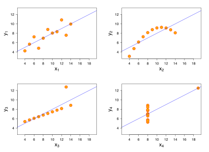
In 1973, the English statistician Francis Anscombe came up with an elegant way of demonstrating this. He created four data sets, each containing 11 data points with two values. In all sets the means and sample variances for the two variables are identical, as are the correlation between the two and the regression line predicting y from x:

anscombe table.png

You'd think these four distributions would be pretty similar, with only minor differences due to random variability. You might also think that linear regression would be an effective model to help make predictions based on the data, in all cases.

But you'd be wrong. These are the four data sets:

image showing Anscombe Quartet
Source: Wikipedia

The upper left graph shows a distribution which is about what we'd expect from the statistics, and the linear regression model is a good fit for this data set. The upper right graph clearly has a curvature. There's likely to be a great model for prediction, but it's NOT linear (the best model probably includes x2).

The two bottom models are more problematic. The one on the left shows a linear relationship – but that one outlier near the top is pulling the regression line away from the rest of the data. And the one on the bottom right is a real challenge. It looks as though, in general, x is a poor predictor for y. That is, almost all cases have an x-value of 8 and the y-values vary quite a bit, untethered to x. And one strange case, all by itself, is driving the entire model. 

A similar situation exists in sports. Looking at summary stats for the season might make for a good model, or might overlook a non-linear relationship, or might be slightly (or greatly) misleading, due to a few unusual games, players, or plays, which may not translate to the post-season. That's why creating a bracket is so much fun!


jenny

About the Author

Jenny is a member of the HBX Course Delivery Team and currently works on the Business Analytics course for the Credential of Readiness (CORe) program, and supports the development of a new course in Management for the HBX platform.

Jenny holds a BFA in theater from New York University and a PhD in Social Psychology from University of Massachusetts at Amherst. She is active in the greater Boston arts and theater community, and she enjoys solving and creating diabolically difficult word puzzles.

Topics: HBX CORe

5 Highly Effective Visual Displays of Data

Posted by Jenny Gutbezahl on January 12, 2017 at 10:42 AM

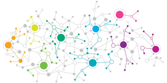
data-networks.png

The past decade has seen the rise of digital databases along with the development of new tools to create engaging, often interactive, visual displays. Today, anyone with an interest in a topic can easily find relevant data and present it in an interesting way.

Here are a few examples that caught my fancy:

Jobs

npr
Source: NPR

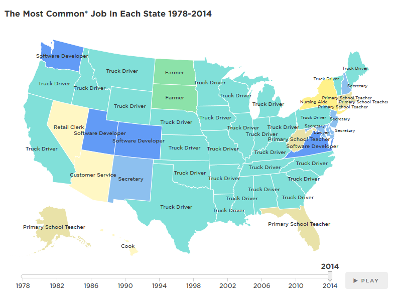
National Public Radio has produced a great animated display of the most common jobs in each state, year by year from 1978 to 2014.

My favorite part: The story is told by jobs that gain in popularity and then become less common.

Web-Related Statistics

internet live stats
Source: Internet Live Stats

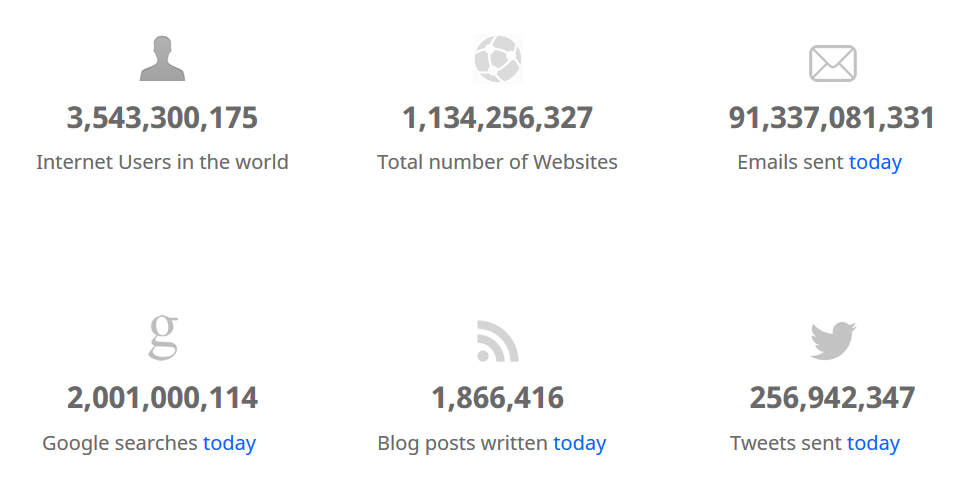
Internet Live Stats has tracked web-related statistics and pioneered methods for visualizing data for several years, and it's instructive to see how different digital properties have ebbed and flowed over time. 

My favorite part: The "One Second" tab, which shows the number tweets, Facebook posts, Instagram photos, and other digital content shared each second. The way they present this information is extremely effective.

Beer

beer
Source: FlowingData

If you love beer as much as I do, you'll appreciate Flowing Data's graphic analysis of beer attributes and how they relate to different styles. And if you just like cool visual displays of data, you'll probably spend a lot of time poking around the site (which I find even more addictive than TV Tropes). 

My favorite part: The examples of each type of beer, which make it easy to find new brews to try.

Food

food
Source: Eater

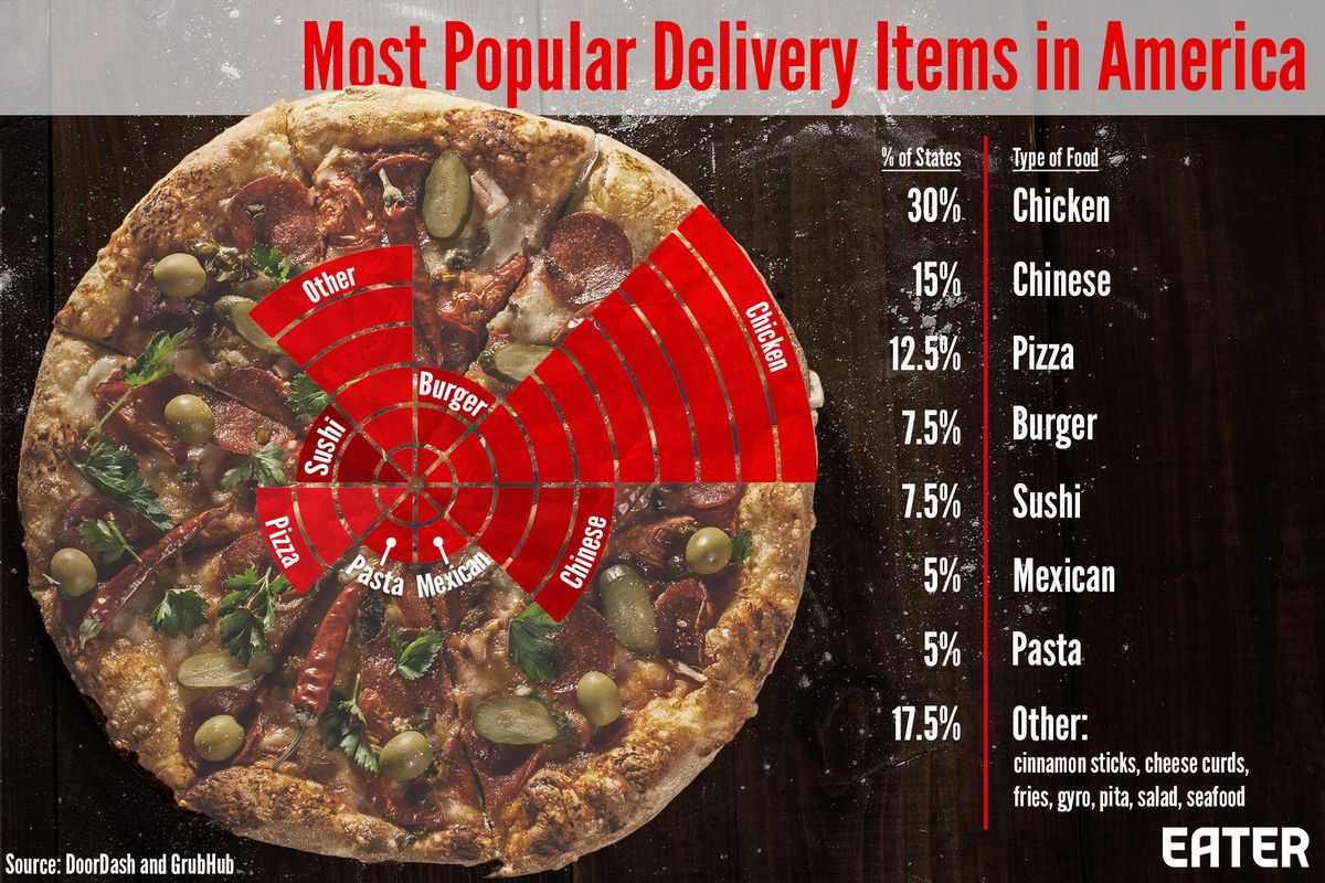
Eater is a great site for all kinds of interesting food information, and has created this interactive, which shows the most common foods ordered for delivery in each state of the US. Warning, this may make you hungry!

My favorite part: Learning that my fellow Massachusetts residents love sushi just as much as I do!

Hamilton

hamilton
Source: Wall Street Journal

And finally the Wall Street Journal gives us an interactive visual presentation on the rhyme structure of the lyrics of Hamilton, along with some qualitative analysis of its influences, ranging from Gilbert and Sullivan to Rakim.

My favorite part: The links to various works that inspired Lin-Miranda as he was writing the show.


Interested in learning more about how to interpret data? Take HBX CORe and discover the basics of Economics for Managers, Financial Accounting, and Business Analytics.

Learn more about HBX CORe


jenny

About the Author

Jenny is a member of the HBX Course Delivery Team and currently works on the Business Analytics course for the Credential of Readiness (CORe) program, and supports the development of a new course in Management for the HBX platform.

Jenny holds a BFA in theater from New York University and a PhD in Social Psychology from University of Massachusetts at Amherst. She is active in the greater Boston arts and theater community, and she enjoys solving and creating diabolically difficult word puzzles.


Topics: HBX CORe, HBX Insights

Why the Polls Seem to Have Agreed to Disagree

Posted by Jenny Gutbezahl on September 27, 2016 at 3:40 PM

election-header.png

If you've been following the election at all, you've probably noticed that some polls give very different estimates of who's likely to win the presidency in November. For example, at 1:00 PM EDT on Tuesday, September 27th [this will probably change by the time you read this]:

  • The New York Times shows Clinton leading 45% to 42%
  • The Los Angeles Times reports Trump leading 46.2% to 42.7%
  • HuffPost Pollster shows Clinton up 47.6% to 44.1%
  • Data analysis site FiveThirtyEight gives three different estimates:
    • Their Polls-only forecast is 55.8% to 44.2% in Clinton's favor
    • Their Polls-plus forecast (which includes such factors as the economy and event-related spikes in either candidate's favor) is 55.2% to 44.7% in Clinton's favor 
    • Their nowcast (what they'd expect if the election were held today) is 52.7% to 47.3% in Clinton's favor

There are a number of reasons for this: they poll different people, using different questions, via different media. For example, polls that use only mobile numbers, and exclude landlines, tend to under-sample older voters. And wording changes as simple as which candidate is mentioned first by the poll can affect responses.

But the biggest differences may be caused by weighting, a method used to make the sample (which may be demographically different from the expected voter turnout) look like the population. Each organization uses its own weighting algorithm, leading to a diversity of predictions. In fact, the New York Times recently shared poll data it had collected with four well-respected analysts.

Even with the exact same data, the different weighting methods led to results varying from a four point lead for Clinton to a one point lead for Trump. That's because each organization has a slightly different idea of what the electorate will look like in terms of gender, ethnicity, education, socio-economic status, etc. These assumptions about who will vote influence what the polls tell us.

One thing is pretty clear: this will be a tight race, and people seem more emotionally invested in it than they have been in many recent elections. And given last night's debate, the numbers will likely fluctuate in the upcoming days.


Interested in learning more about how to interpret data? Take HBX CORe and discover the basics of Economics for Managers, Financial Accounting, and Business Analytics.

Learn more about HBX CORe


jenny

About the Author

Jenny is a member of the HBX Course Delivery Team and currently works on the Business Analytics course for the Credential of Readiness (CORe) program, and supports the development of a new course in Management for the HBX platform. Jenny holds a BFA in theater from New York University and a PhD in Social Psychology from University of Massachusetts at Amherst. She is active in the greater Boston arts and theater community, and she enjoys solving and creating diabolically difficult word puzzles.


Topics: HBX CORe, HBX Insights

A Picture is Worth a Thousand (Wrong) Words

Posted by Jenny Gutbezahl on September 6, 2016 at 10:27 AM

graphs.png

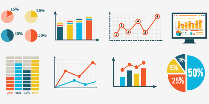
Graphs can be an effective way of communicating information about data. However, when poorly used they can be confusing, inaccurate, or misleading. Thanks to the internet, many of the worst displays of data remain long after their creators have identified the problems and corrected or removed them. Here are five of the more egregious instances that have shown up over the past few years.

1. The pieces of a pie should add up to 100%.

data1
Source: Everydata

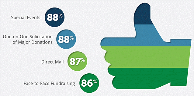
There's a couple of things wrong with this graph. First, any chart (such as a pie chart) that divides a single image into subsection should sum to 100%. This chart shows distinct stripes, but clearly if 88% of organizations raise funds via one-on-one solicitations and 87% use direct mail, there must be some overlap. Secondly, the four categories are virtually the same size, but there's about six times as much ink for Direct Mail (which 87% of organizations use) as for Special Events (which 88% use).

2. Shapes have meaning.

data2
Source: NBC Nightly News

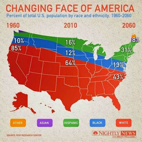
This chart does show about 100% in each column of figures, but the choice of shape makes it confusing. The different parts of the map have distinct meaning, beyond the demographics listed. Given this, it looks like Asians only live in Maine and Washington and that Texas existed only in 2010.

3. Start numbering at zero.

data3
Source: Business Insider

One common problem in graphs is misuse of the y-axis (the vertical axis at the left of the graph, which often indicates frequency). The y-axis isn't labelled here, but it looks like it probably ranges from about 73 to 78, which makes the drop from 77.3 to 75.3 seem precipitous. But if the graph covered a more reasonable range of knuckleball speeds (say 40-100 mph), the decrease would seem much smaller.

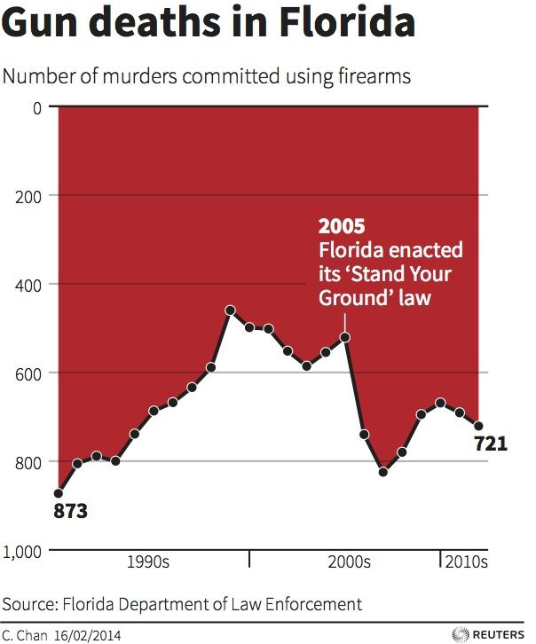
4. Numbers should read up from zero.

data4
Source: Free Thought Blogs

In this case, the y-axis has actually been inverted, so that the highest numbers are on the bottom. Logically, there's no reason you couldn't make a graph like this, and the graph does include the scale of the y-axis. However, we're so used to seeing graphs with the high numbers on the top, that we automatically assume that the change after 2005 is a decrease, when it's actually an increase.

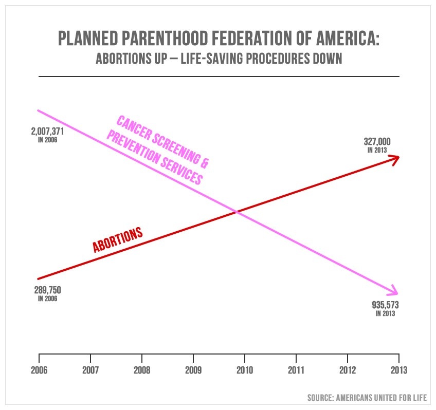
5. Use the same scale for both axes.

data5
Source: PolitiFact

The lack of labeling on the y-axis is particularly confusing, because it appears that the two lines on the graph are using entirely different axe. The change in both lines appears to be about the same, even though one change is almost 30 times as great as the other (the red line goes up 37,250 and the pink line goes down 1,071,987). Furthermore, on the left side of the graph, the smaller number is on the bottom, while on the right side, the smaller number is at the top.

Graphs can be a great tool to tell stories about data. However, just like language, images can confuse or deceive. So it's worthwhile to be a conscientious consumer of data and make sure that the pictures you see accurately reflect the numbers.


Interested in learning more about how to interpret data? Take HBX CORe and discover the basics of Economics for Managers, Financial Accounting, and Business Analytics.

Learn more about HBX CORe


jenny

About the Author

Jenny is a member of the HBX Course Delivery Team and currently works on the Business Analytics course for the Credential of Readiness (CORe) program, and supports the development of a new course in Management for the HBX platform. Jenny holds a BFA in theater from New York University and a PhD in Social Psychology from University of Massachusetts at Amherst. She is active in the greater Boston arts and theater community, and she enjoys solving and creating diabolically difficult word puzzles.

Topics: HBX CORe, HBX Insights

3 Reasons You Should Take Statistical Significance with a Grain of Salt

Posted by Jenny Gutbezahl on August 2, 2016 at 12:08 PM

coin-flip-2-to-1.png

If you read the results of any type of study, you've likely been told that results are "significant" in at least some cases. Clickbait headlines may use the word "significance" to make readers think the finding is important. But significance and importance are two very different things.

What is statistical significance, again?


Statistical Significance: A statistic is considered significant if the likelihood of it occurring by chance is less than a preselected significance level (often 0.05 or less).


If you're in need of a more in-depth refresher, check out this helpful article from Harvard Business Review HERE.

How can you tell if a finding that is statistically significant is actually important? Here are three things to keep an eye out for.

1. Just because something is statistically significant does not mean that it isn't due to chance.

For example, if you tossed a coin 5 times, it is unlikely to come up heads all 5 times. There are 32 possible outcomes for tossing a coin 5 times and only one way to get 5 heads. So you'd only expect to get 5 heads one time out of 32 on average, or about 3% of the time. Generally, anything that would happen by chance less than 5% of the time is considered to be statistically significant. Thus, an unscrupulous researcher could get "significant" effects simply by conducting a lot of analyses and picking the ones that reach the threshold.

2. Just because something is not statistically significant doesn't mean that it isn't due to a real effect.

If one hundred people each tossed a fair coin 5 times, we'd expect 3 of them to get 5 heads in a row. Similarly, just because something is not statistically significant doesn't mean that it is due to chance. If a weighted coin that comes up heads 80% of the time is tossed 5 times, it may well come up 4 heads and 1 tail, a distribution that would happen 16% of the time by chance with a fair coin, so it would not reach statistical significance. Thus, an unscrupulous researcher could report "no effect" of something simply by conducting a study with a very small sample and little power to detect differences.

3. Just because something is statistically significant does not mean that it is practically significant.

When I was in graduate school, I fractured my navicular bone, a small bone in the wrist. My doctor told me that I could get a cast that stopped either right below my elbow, or one that continued past my elbow & would keep my arm bent until the cast came off. He informed me that medical research indicated that people spend (statistically) significantly longer in a cast if it stops below the elbow.

That certainly seemed like a good argument for getting a longer cast! But I asked for the average time spent in a cast under each condition. He told me that people who got the shorter cast spent, on average, a full six weeks in a cast while those who had their elbow immobile were out of the cast in only five weeks and six days! This may have been statistically significant, but the practical significance was not great enough for me to give up bending my elbow for a month and a half.

When you hear about a "significant" finding, you should take it with a grain of salt, especially if it's only seen in one study. A report about, say, chocolate significantly reducing the chance of hair loss (something I'm completely making up – I've never seen that particular claim), could be the result of either lots of analyses producing one statistically significant result by chance. Or it could be the result of a study that found a very small connection (for example, eating 5 pounds of chocolate a day would delay the onset of hair loss by 45 minutes), that happened to be unlikely due to chance.


Interested in learning Financial Accounting, Business Analytics, and Economics for Managers?

Learn more about HBX CORe


jenny

About the Author

Jenny is a member of the HBX Course Delivery Team and currently works on the Business Analytics course for the Credential of Readiness (CORe) program, and supports the development of a new course in Management for the HBX platform. Jenny holds a BFA in theater from New York University and a PhD in Social Psychology from University of Massachusetts at Amherst. She is active in the greater Boston arts and theater community, and she enjoys solving and creating diabolically difficult word puzzles.

Topics: HBX CORe, HBX Insights

To P-Value or Not to P-Value - That is the Question

Posted by Jenny Gutbezahl on May 17, 2016 at 8:22 AM

jellybeans-2-to-1.png

For centuries, the p-value has been the gold standard of statistical testing. Whether it’s determining whether a specific result is significant, or deciding whether a study is publishable, the science and business communities have used p-values as a main criterion. If the p-value is less than 0.05, we reject the null and conclude that something is going on. If the p-value is greater than 0.05, we fail to reject the null and conclude that there’s nothing to see here; move along.

However, over the past few years, more and more disciplines have been questioning the validity of the p-value. For example, most of the major psychology journals have either stopped using the p-value as a criterion for publication, or have banned its use entirely.

The p-value doesn’t give any indication of how important the results are (that is, it doesn’t measure the magnitude of the effect); it doesn’t even give an indication of how likely it is that the results are due to more than random chance. All a p-value communicates is how likely a result would be IF the phenomenon under review WASN’T there. If you find this confusing, you’re not alone; it’s a very peculiar way of looking at a question.

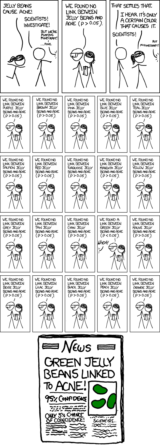
Let’s take a concrete example. Imagine scientists wanted to find a connection between jelly beans and cancer. They could collect a lot of data about people’s jelly bean consumption habits and the incidence of cancer, and then perform statistical analysis to see if there’s a relationship. Well, spurious correlations are abundant in the real world, so we’d expect at least a slight connection, just by random chance.

The question is: are the patterns we’re seeing in the data GREATER than what we’d expect by random chance. If there were no correlation between jelly beans and cancer, each sample would give a slightly different result, but they’d all be pretty close to showing no relationship. At a certain point, they’d be far enough from showing no relationship that we’d say “Hey, it’s REALLY unlikely that we’d see this if there were no relationship; so there probably is one.”

Usually, our threshold for REALLY unlikely is 0.05. If the null hypothesis were true (if there were no relationship between jelly beans and cancer), we’d only see results this extreme 5% of the time. We consider that unusual enough that we could say, hey! There’s something going on here.

xkcd
Source: xkcd

This means we would imagine that if we do 20 studies where nothing is going on, we’d expect, on average, that one of the studies would end up statistically significant at p<.05, just by chance. Let’s say we do 20 studies, and three of them end up significant. On average, one of the three is just due to chance, and the other two are the result of an actual phenomenon. However, we have no way to identify the one that is just random chance. Furthermore, a result of p=.04999 and result of p=.05001 are virtually identical; but one is “significant” and the other is not.

This doesn’t mean p-values are worthless. But it does mean that researchers (and consumers of research) need to be thoughtful when interpreting them. A p-value by itself doesn’t tell you much, and simply knowing that a result is “significant” tells you even less. More useful is an estimate of the effect size, or a review of multiple studies looking at the same phenomenon.

To learn more, check out this great post from PLOS.


jenny

About the Author

Jenny is a member of the HBX Course Delivery Team and currently works on the Business Analytics course for the Credential of Readiness (CORe) program, and supports the development of a new course in Management for the HBX platform. Jenny holds a BFA in theater from New York University and a PhD in Social Psychology from University of Massachusetts at Amherst. She is active in the greater Boston arts and theater community, and she enjoys solving and creating diabolically difficult word puzzles.

Topics: HBX CORe, HBX Courses, HBX Insights

A Scandal in Black and White

Posted by Jenny Gutbezahl on March 8, 2016 at 11:06 AM

crossword-2-to-1.png

I start everyday by doing a crossword puzzle, and I spend most of each day working on statistics (including supporting HBX CORe’s Business Analytics course). So I was excited when fellow crossword and data lover Saul Pwanson starting compiling a database of crossword puzzles published in various venues since 2003.A couple of weeks ago, puzzlemaker Ben Tausig (who edits the wonderful American Value crossword) noticed something interesting about some of the grids. A statistical analysis confirmed his suspicions: a significant number of puzzles published in USA Today or syndicated by Universal Crossword appeared to have been plagiarized. Interestingly, both the USA Today puzzle and Universal are edited by the same person, Timothy Parker.

Regular solvers know that it’s not unusual to see a specific word show up in multiple puzzles, even words like ETUI or ANILE that rarely show up anywhere else. However, the USA Today and Universal puzzles often contained long phrases that had appeared in previous puzzles. In some cases, almost the entire grid was identical to an earlier puzzle. Overall, more than one in six USA Today puzzles contained 25% or more material that had been published elsewhere. So did more than one in twenty of the Universal puzzles. For comparison, less than one in one thousand New York Times crosswords matched other puzzles that closely.

So far Parker, who is known as the most prolific editor in the crossword world, has denied any wrongdoing. However, the scandal continues to gain steam. Even the normally conflict-averse Will Shortz (editor of the New York Times crossword) has called this “an obvious case of plagiarism.” Interestingly, Parker has taken a sabbatical while his employer, Universal Uclick, investigates.

To learn more about the scandal and how crossword puzzles work, check out this great article by FiveThirtyEight: http://fivethirtyeight.com/features/a-plagiarism-scandal-is-unfolding-in-the-crossword-world/


jenny

About the Author

Jenny is a member of the HBX Course Delivery Team and currently works on the Business Analytics course for the Credential of Readiness (CORe) program, and supports the development of a new course in Management for the HBX platform. Jenny holds a BFA in theater from New York University and a PhD in Social Psychology from University of Massachusetts at Amherst. She is active in the greater Boston arts and theater community, and she enjoys solving and creating diabolically difficult word puzzles.

Topics: HBX CORe, HBX Courses, HBX Insights

3 Lessons on Customer Privacy That Were Learned the Hard Way

Posted by Jenny Gutbezahl on September 1, 2015 at 4:09 PM

In the digital age, businesses have access to extensive information about their customers. This information can help businesses personalize offerings and reach consumers in a way that reflects their individuality. Advances in analytics make it easier to combine information about things like preferences, shopping patterns, and sensitivity to price into useful templates for suggesting products. This seems like a win-win for both marketers, who can identify those who are most likely to want their products, and end users, who receive communications tailored specifically to them.

However, privacy is a major issue when it comes to using customer data. As more and more people share information online and breaches become more common, the importance of protecting individuals’ identity has grown. Despite trying to preserve the privacy of their customers, companies sometimes run into problems when using customer data in their marketing and advertising.

data-privacy-2-1

Protecting Customer Privacy is Paramount

In October 2006, Netflix offered $1,000,000 dollars to any individual or group who could figure out a way to improve its DVD recommendations to subscribers by 10% or more. It released historical data from hundreds of thousands of users (with identifying information removed) about the grades they’d given to various movies.

Although they stripped names and ID numbers from the data, many Netflix customers also used other ratings sites, such as IMDB. Comparing ratings on IMDB with those in the shared Netflix database allowed researchers to accurately determine the user’s identity. This ultimately led to an expensive legal settlement, and Netflix never implemented the winning algorithm.

It was later found that Netflix could have invested in data masking technology to avoid the issues with anonomizing the customer data. This would've cost about $50,000, a tiny amount compared to their expensive legal settlement.

Want to read more?

Content That's Too Targeted Can Miss the Mark

In 2010, Target implemented a new algorithm looking at changes in customers’ buying habits to identify women who were newly pregnant. Target was able to reach out to these women and offer them products that would be useful to them. Because pregnancy and its associated changes happen quickly, a rapid algorithm was valuable.

However, the company found itself in the middle of a scandal when it sent ads for baby products to a teenage girl living with her parents, whom she had not yet told about her condition. This story exploded over the news and social media.

Target has since eased up on its direct marketing and now includes products of interest to a wider audience along with any targeted promotions to avoid similar situations in the future.

Allow Users to Opt In

On Black Friday in 2011, two malls used a new mobile technology to track shoppers as they moved through the mall, allowing them to send location-specific alerts to customer’s phones. In addition to helping marketers target the right people, monitoring the flow of shoppers through the mall would help stores determine how to staff during the busy holiday season. Unfortunately, this was done without the knowledge or consent of shoppers.

Not only were mall visitors upset about marketers’ use of their phone, but Senator Chuck Schumer (D-NY) denounced the practice at a press conference. Both malls cancelled the program, which was intended to run though New Year, within a week.

This example highlights the importance of allowing customers to opt-in and voluntarily provide their data to preserve their right to privacy. Rather than technology that collects data from any mall visitor who hasn’t turned off their phone, some stores are now using a similar technology, but only with customers who choose to install an app on their phone.

Key Takeaways

Customer data is a powerful tool that companies can harness to inform every facet of their business. But as the saying goes, with great knowledge comes great responsibility.

Companies must do everything they can to preserve customers' privacy, keep them informed of how their data is being used, provide consumers with options to opt in or out, and walk the fine line between serving up relevant, targeted content and turning into Big Brother.


jenny

About the Author

Jenny is a member of the HBX Course Delivery Team and currently works on the Business Analytics course for the Credential of Readiness (CORe) program, and supports the development of a new course in Management for the HBX platform. Jenny holds a BFA in theater from New York University and a PhD in Social Psychology from University of Massachusetts at Amherst. She is active in the greater Boston arts and theater community, and she enjoys solving and creating diabolically difficult word puzzles.

Topics: HBX CORe, HBX Courses, HBX Insights