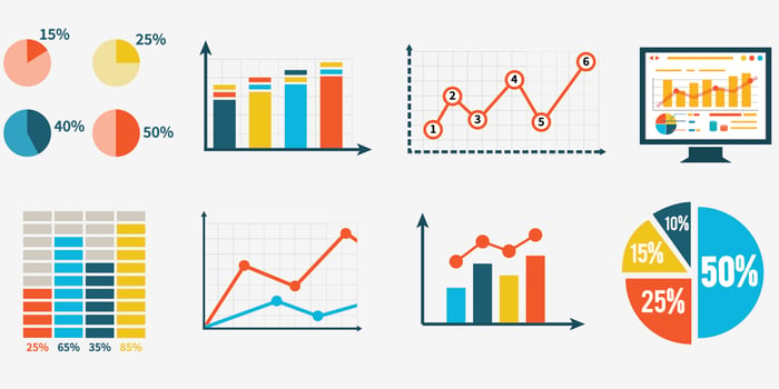
Graphs can be an effective way of communicating information about data. However, when poorly used they can be confusing, inaccurate, or misleading. Thanks to the internet, many of the worst displays of data remain long after their creators have identified the problems and corrected or removed them. Here are five of the more egregious instances that have shown up over the past few years.
1. The pieces of a pie should add up to 100%.
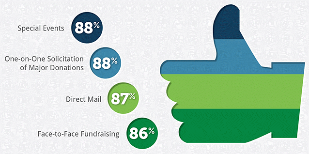
There's a couple of things wrong with this graph. First, any chart (such as a pie chart) that divides a single image into subsection should sum to 100%. This chart shows distinct stripes, but clearly if 88% of organizations raise funds via one-on-one solicitations and 87% use direct mail, there must be some overlap. Secondly, the four categories are virtually the same size, but there's about six times as much ink for Direct Mail (which 87% of organizations use) as for Special Events (which 88% use).
2. Shapes have meaning.
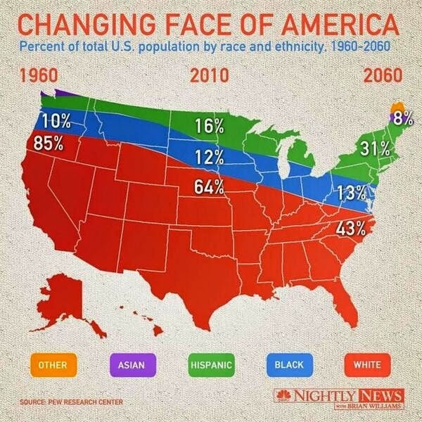
This chart does show about 100% in each column of figures, but the choice of shape makes it confusing. The different parts of the map have distinct meaning, beyond the demographics listed. Given this, it looks like Asians only live in Maine and Washington and that Texas existed only in 2010.
3. Start numbering at zero.
One common problem in graphs is misuse of the y-axis (the vertical axis at the left of the graph, which often indicates frequency). The y-axis isn't labelled here, but it looks like it probably ranges from about 73 to 78, which makes the drop from 77.3 to 75.3 seem precipitous. But if the graph covered a more reasonable range of knuckleball speeds (say 40-100 mph), the decrease would seem much smaller.
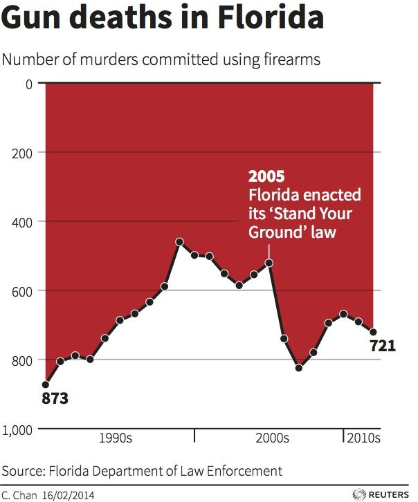
4. Numbers should read up from zero.
In this case, the y-axis has actually been inverted, so that the highest numbers are on the bottom. Logically, there's no reason you couldn't make a graph like this, and the graph does include the scale of the y-axis. However, we're so used to seeing graphs with the high numbers on the top, that we automatically assume that the change after 2005 is a decrease, when it's actually an increase.
5. Use the same scale for both axes.
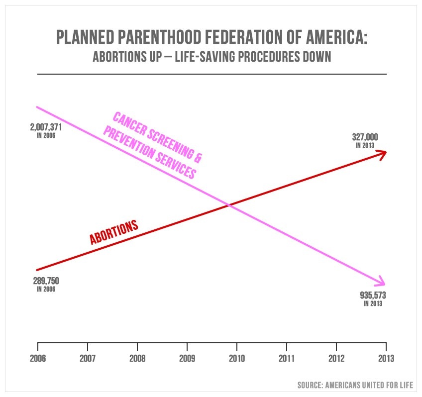
The lack of labeling on the y-axis is particularly confusing, because it appears that the two lines on the graph are using entirely different axe. The change in both lines appears to be about the same, even though one change is almost 30 times as great as the other (the red line goes up 37,250 and the pink line goes down 1,071,987). Furthermore, on the left side of the graph, the smaller number is on the bottom, while on the right side, the smaller number is at the top.
Graphs can be a great tool to tell stories about data. However, just like language, images can confuse or deceive. So it's worthwhile to be a conscientious consumer of data and make sure that the pictures you see accurately reflect the numbers.
Interested in learning more about how to interpret data? Take HBX CORe and discover the basics of Economics for Managers, Financial Accounting, and Business Analytics.
About the Author
Jenny is a member of the HBX Course Delivery Team and currently works on the Business Analytics course for the Credential of Readiness (CORe) program, and supports the development of a new course in Management for the HBX platform. Jenny holds a BFA in theater from New York University and a PhD in Social Psychology from University of Massachusetts at Amherst. She is active in the greater Boston arts and theater community, and she enjoys solving and creating diabolically difficult word puzzles.


